Autocomplete form control added
Overlay-based, async-friendly, and template-driven — built for enterprise forms.
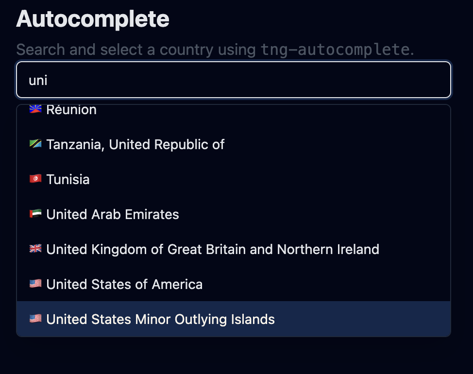
(Optional) Add screenshot to make the update more visual.
Overlay-based UX
TailNG Autocomplete renders the dropdown inside an overlay (not inside the normal DOM flow). This avoids z-index battles and ensures the popup aligns reliably to the input.
- Anchor-based placement: uses the input element as the overlay anchor.
- Width sync: overlay can match anchor width (width="anchor").
- Close reasons: selection, escape, blur, outside click, or programmatic.
Works with Angular forms (CVA)
Autocomplete implements ControlValueAccessor, so it works with both reactive forms and template-driven forms.
- writeValue sets selected item + input fallback text.
- onChange(null) fires when user types (selection cleared).
- setDisabledState closes overlay and disables the input.
Async search friendly
Typing emits the raw text via search, so you can fetch results from an API. The form value remains the selected object (not the raw string).
1) user types → inputValue updates
2) selection clears → form value becomes null
3) search.emit(text) → you fetch options
4) options update → overlay shows results
5) user selects → form value becomes selected item
Template-driven rendering
Autocomplete supports projected templates for both option rows and the selected-value display inside the input.
Provide a custom row layout (icons, subtitles, badges, etc.).
<ng-template #optionTpl let-item>
  <div class="flex items-center gap-2">
    <span class="font-medium">{{ item.name }}</span>
    <span class="text-xs text-slate-500">{{ item.code }}</span>
  </div>
</ng-template>Render a rich selected value overlay inside the input when not typing.
<ng-template #inputTpl let-item>
  <div class="flex items-center gap-2">
    <span class="font-medium">{{ item.name }}</span>
    <span class="text-xs text-slate-500">{{ item.code }}</span>
  </div>
</ng-template>
Selected template is shown only when overlay is closed and a selected value exists.
Keyboard navigation
Navigation and selection keys are delegated to TngOptionList while typing stays native to the input. Escape closes the overlay at the Autocomplete level.
- ArrowUp / ArrowDown: move active option (opens if closed).
- Enter: select active option.
- Home / End / PageUp / PageDown: list navigation.
- Escape: close overlay.
Theme-safe styling
The input uses TailNG theme tokens (bg-bg, text-fg, border-border) so the component remains compatible with mode changes.
border rounded-md px-3 py-2 text-sm
focus:outline-none focus:ring-2 focus:ring-primary
bg-bg text-fg
Next
Explore docs, usage patterns, and related form components.